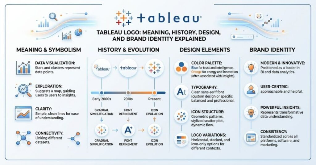
The tableau logo is one of the most recognizable identities in the business intelligence industry. It combines a distinctive multicolored cluster of plus signs arranged into a larger cross with the lowercase “tableau” wordmark. While simple at first glance, every element has a purpose. The colorful geometric symbol represents relationships between data points, while the clean typography reinforces the software’s focus on clarity and accessibility.
Since Tableau was founded in 2003, its visual identity has become synonymous with interactive dashboards, data storytelling, and modern analytics. Millions of users—from small businesses to Fortune 500 companies—associate the logo with software that transforms raw information into meaningful visual insights.
Unlike many technology companies that frequently redesign their branding, Tableau has maintained a consistent identity. This continuity has helped strengthen customer trust while making the logo instantly recognizable across websites, applications, training materials, conferences, and marketing campaigns.
This guide explores the history, design philosophy, symbolism, branding strategy, practical applications, and future of the Tableau logo.
The History of Tableau
Tableau was founded in 2003 after research conducted at Stanford University on making databases easier to visualize. Rather than requiring users to write complex queries, Tableau introduced intuitive drag-and-drop analytics.
From the beginning, the company’s visual identity reflected this philosophy.
Instead of adopting a technical-looking logo filled with abstract symbols or futuristic graphics, Tableau chose a simple geometric design that communicates organization, relationships, and discovery.
As Tableau expanded globally, the logo evolved only through subtle refinements.
Major improvements included:
- Cleaner typography
- Better spacing
- Improved digital scalability
- Sharper rendering on high-resolution displays
The core symbol, however, remained virtually unchanged, reinforcing long-term brand recognition.
Understanding the Tableau Logo Design
The Tableau logo contains two primary elements:
- The multicolored cross symbol
- The lowercase wordmark
Together they create an identity that feels both technical and approachable.
The Colorful Cross Symbol
The icon consists of numerous colored plus signs arranged into a larger cross-like structure.
Instead of using one solid shape, Tableau uses many smaller elements.
This communicates several ideas:
- Multiple data sources
- Individual data points
- Connected information
- Collaboration
- Visual exploration
Rather than representing a single answer, the symbol suggests discovering patterns through connected information.
The Wordmark
The word “tableau” appears entirely in lowercase.
This typography creates a friendly appearance compared to many enterprise software companies that rely on uppercase lettering.
Its clean lines improve readability across:
- Desktop applications
- Mobile devices
- Documentation
- Presentations
- Marketing materials
What the Colors Represent
Although Tableau has never officially assigned a meaning to every individual color, branding experts generally interpret the palette as representing diversity and exploration.
| Color Characteristic | Possible Meaning |
| Multiple colors | Diverse datasets |
| Bright appearance | Discovery and insight |
| Balanced arrangement | Organized information |
| Repeating shapes | Consistency across data |
| Symmetrical layout | Structured analytics |
The use of multiple colors also distinguishes Tableau from competitors that rely on one or two dominant brand colors.
Why the Plus Signs Matter
The plus sign is one of the most interesting aspects of the logo.
Instead of decorative graphics, Tableau chose a symbol commonly associated with:
- Adding information
- Combining datasets
- Positive outcomes
- Mathematical relationships
- Connections
When dozens of these plus signs combine into one larger figure, they reinforce Tableau’s core purpose:
Helping users connect separate pieces of information into meaningful stories.
Logo Evolution Through the Years
Unlike many technology companies that undergo complete visual rebrands every few years, Tableau has preferred gradual refinement.
| Period | Visual Changes | Reason |
| Early Years | Original colorful icon | Brand establishment |
| Growth Stage | Typography refinement | Better readability |
| Enterprise Expansion | Improved spacing | Digital consistency |
| Salesforce Era | Minor modern adjustments | Integration across ecosystems |
The recognizable symbol has remained intact throughout these updates.
The Tableau Logo After the Salesforce Acquisition
In 2019, Tableau became part of Salesforce.
Whenever a large acquisition occurs, people often expect dramatic branding changes.
Interestingly, Salesforce chose to preserve Tableau’s established identity.
There were good reasons for this decision.
Tableau had already earned tremendous recognition within analytics and business intelligence.
Changing the logo completely could have weakened years of accumulated brand equity.
Instead, Salesforce integrated Tableau into its broader product ecosystem while allowing the iconic symbol to remain largely unchanged.
Branding Lessons from Tableau
The Tableau logo demonstrates several branding principles that extend beyond software.
Simplicity Wins
The logo is memorable because it avoids unnecessary complexity.
There are no gradients, shadows, or excessive detail.
Consistency Builds Trust
Customers have seen essentially the same symbol for years.
Consistency reinforces credibility.
Symbolism Matters
Every design element communicates the company’s mission.
The logo does more than decorate products—it tells a story.
Comparison with Other Analytics Platforms
| Platform | Logo Style | Primary Focus | Brand Personality |
| Tableau | Multicolored cross | Visual analytics | Friendly and modern |
| Microsoft Power BI | Yellow abstract icon | Business intelligence | Corporate |
| Qlik | Green minimalist design | Associative analytics | Professional |
| Looker | Simple typography | Cloud analytics | Clean and technical |
Each logo reflects a different branding philosophy.
Tableau’s colorful identity emphasizes exploration more than technical complexity.
Practical Branding Implications
A successful logo influences much more than appearance.
For Tableau, the visual identity supports:
- Product recognition
- Conference branding
- Online learning
- Documentation
- Customer loyalty
- Partner marketing
- Community events
Because the logo scales well, it performs effectively across websites, mobile interfaces, presentations, and printed materials.
Risks and Trade-Offs
Even strong logos face limitations.
Some challenges include:
Complexity at Small Sizes
Very small versions may lose some color detail.
Color Dependency
Printing limitations can reduce visual impact.
Trademark Protection
Well-known logos require careful legal protection against unauthorized use.
Brand Consistency
Partners and third-party publishers must follow official usage guidelines to maintain recognition.
Why the Logo Works So Well
Several psychological principles explain its effectiveness.
The design combines:
- Symmetry
- Color diversity
- Repetition
- Simplicity
- White space
These characteristics improve visual memory.
Research in branding consistently shows that recognizable geometric patterns are easier to recall than highly detailed illustrations.
The Future of Tableau Logo in 2027
Looking toward 2027, dramatic changes appear unlikely.
Technology brands increasingly value consistency over frequent redesigns.
Future refinements may include:
- Better accessibility for digital interfaces
- Enhanced visibility on wearable devices
- Improved dark-mode compatibility
- Optimized rendering for AI-powered applications
- Greater flexibility across immersive interfaces
However, the colorful cross is likely to remain the centerpiece of Tableau’s visual identity because it has become closely associated with the company’s mission and reputation.
Key Takeaways
- The Tableau logo represents connected data rather than individual charts.
- Multiple plus signs symbolize relationships between information.
- The colorful design differentiates Tableau from competitors.
- Consistency has strengthened long-term brand recognition.
- The lowercase wordmark reinforces accessibility and simplicity.
- Salesforce wisely preserved the established identity after acquiring Tableau.
- Strong branding depends as much on consistency as creativity.
Conclusion
The Tableau logo is an excellent example of purposeful design. Rather than relying on flashy graphics or short-lived design trends, it communicates the company’s mission through simple geometric forms, thoughtful color choices, and clean typography. The distinctive cluster of multicolored plus signs has become a recognizable symbol of visual analytics, helping users instantly associate the brand with data exploration and insight.
Its success also highlights an important branding lesson: memorable identities are built through consistency. Over two decades, Tableau has refined its logo without abandoning the visual language that customers already recognize and trust. Even after joining Salesforce, the company preserved the logo’s core elements, demonstrating the value of established brand equity.
As analytics continues to evolve with artificial intelligence and cloud computing, the Tableau logo is well positioned to remain a lasting symbol of accessible, data-driven decision-making.
Frequently Asked Questions
What does the Tableau logo represent?
The logo symbolizes connected datasets, collaboration, and meaningful insights through a colorful arrangement of plus signs forming a larger cross.
Why is the Tableau logo colorful?
The multiple colors visually represent diversity, relationships, and the variety of information users analyze within the Tableau platform.
Has the Tableau logo changed over time?
Only subtly. Typography and spacing have been refined while preserving the recognizable icon.
Why is “tableau” written in lowercase?
Lowercase typography creates a friendly, approachable identity while improving readability across digital platforms.
Did Salesforce change the Tableau logo?
Following the acquisition, Salesforce retained Tableau’s established logo because of its strong brand recognition within the analytics industry.
Can businesses freely use the Tableau logo?
No. Like other trademarks, the Tableau logo is protected and should only be used according to the company’s official brand guidelines.
Methodology
This article was prepared by analyzing Tableau’s public branding, historical company information, visual identity principles, and widely accepted branding practices. The analysis focuses on design interpretation rather than speculation. Readers should consult Tableau’s official brand resources for the latest trademark and usage guidelines.