
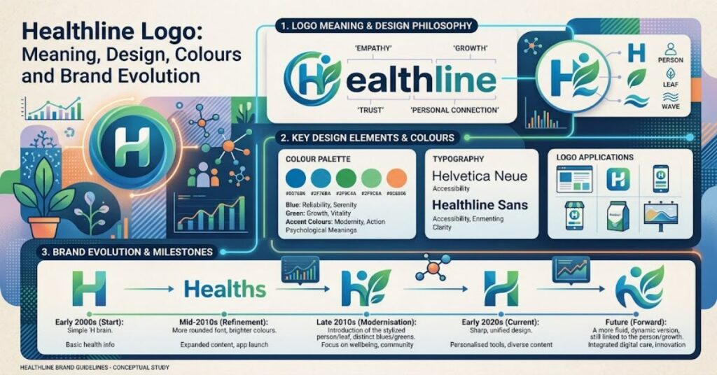
The healthline logo is the visual signature of Healthline, a major digital health information publisher. Its appearance may seem straightforward, but the identity combines several deliberate design decisions involving typography, colour, symbolism and digital usability.
The wordmark uses lowercase lettering with a distinctive serif character. Alongside it, Healthline maintains a separate circular “h” symbol associated with whole-person health. Together, these elements create a visual system that can work across articles, mobile interfaces, social media, video and other digital formats.
One important point needs clarification. Healthline’s official brand guidelines identify black as the primary colour for the logo, with a white reverse version for dark backgrounds. Cyan is certainly an important part of the wider Healthline colour palette, but it should not automatically be treated as the primary colour of the wordmark.
This distinction is useful for anyone researching the brand, analysing its visual evolution or trying to identify an authentic Healthline asset.
The identity also reflects the challenges faced by digital health publishers. A health brand needs to appear approachable enough for everyday readers while maintaining an association with reliability and professional information. Healthline’s logo addresses that challenge through restrained typography and a flexible symbol rather than through an overly clinical appearance.
What Does the Healthline Logo Look Like?
The Healthline wordmark is presented in lowercase, giving the brand a softer visual personality than many conventional corporate identities.
Healthline describes its lettering as an emotive serif treatment. That choice is significant because serif typography can suggest editorial credibility, while the lowercase format creates a more approachable impression.
The brand also uses a separate circular logomark built around the letter “h”. Healthline describes the organic circle as representing whole-person health. The “h” creates a visual opening that can also function as a flexible branded element in digital applications.
| Logo Element | Purpose | Brand Effect |
| Lowercase wordmark | Primary brand identification | Human and approachable |
| Serif typography | Distinctive visual character | Editorial authority |
| Circular “h” mark | Compact brand identifier | Whole-person health association |
| Black logo | Primary application | Strong contrast and clarity |
| White reverse logo | Dark-background application | Flexible digital use |
| Cyan palette | Supporting brand system | Health and energy associations |
The relationship between these components is important. The wordmark provides immediate name recognition, while the circular symbol offers a more compact identifier for situations where the full name may not fit comfortably.
Why Healthline Changed Its Logo
Healthline publicly introduced a redesigned logo in 2019. The redesign came as the organisation was expanding its reach and adapting to an increasingly mobile digital audience.
At the time, Healthline Media reported that its content reached 76 million people and that mobile represented 76% of its traffic. The company explained that the new identity needed to work effectively across small screens and social-media environments.
That context helps explain why simplicity became important.
A digital publisher’s logo can appear in many places. It may sit at the top of a desktop article, appear inside a mobile browser, occupy a small social-media profile, overlay a video or appear within an email newsletter.
A mark that works beautifully at a large size can become difficult to recognise when reduced substantially. Healthline’s identity therefore includes reproduction and clear-space rules designed to preserve legibility.
For example, the brand guidelines specify a minimum width for certain web and video applications. Such specifications are practical rather than decorative: they help prevent the logo from becoming illegible or visually distorted.
Healthline Logo Colours Explained
Colour is one of the areas where descriptions of the Healthline identity can become confusing.
The official brand guidelines identify black as the primary logo colour and provide a white reverse version for darker backgrounds. At the same time, the wider Healthline visual system contains several cyan shades alongside additional accent colours.
| Colour Family | Typical Role | Example Hex Value |
| Healthline Black | Primary wordmark | #231F20 |
| Dark Cyan | Wider brand palette | #08565C |
| Main Cyan | Digital and editorial design | #02838D |
| Light Cyan | Supporting backgrounds | #81B9BF |
| Gold | Accent colour | #FCBA44 |
| Tangerine | Accent colour | #F0533A |
| Magenta | Accent colour | #DB1F88 |
This produces an important distinction: the logo itself and the broader colour system should not be treated as identical.
A Healthline webpage may use substantial amounts of cyan, which can lead viewers to assume that the wordmark itself is officially cyan. The published brand specifications provide a more precise picture.
For brand reproduction, the safest approach is to follow the official logo rules rather than infer logo colours from individual webpages or screenshots.
Typography and Brand Recognition
Typography plays a central role in Healthline’s identity.
The company identifies Proxima Nova as its corporate typeface. Different weights and variations serve different purposes, including headlines, callouts and body text.
The logo typography should therefore be considered separately from the supporting type system. The wordmark creates recognition, while the corporate typeface helps establish consistency across articles, graphics and digital experiences.
This distinction is common in mature brand systems. A logo needs to remain distinctive, while supporting typography needs to remain practical.
For Healthline, the combination creates a visual hierarchy. Readers can recognise the organisation through its wordmark while encountering a consistent typographic treatment throughout its broader publishing environment.
Healthline Logo and Medical Trust
A health information publisher has a particular branding challenge.
The visual identity needs to feel accessible to ordinary readers without appearing so casual that it undermines confidence in the information. At the same time, a highly institutional identity could make health information feel distant or intimidating.
Healthline positions its publishing operation around accessible health information, expert review and medical integrity. Its editorial structure includes healthcare professionals who contribute to medical review and clinical guidance.
The logo contributes to that environment indirectly.
Its softer typography avoids an excessively institutional appearance, while the restrained wordmark maintains a sense of structure. The result is a visual balance between warmth and authority.
This matters because visual trust is often established before a reader evaluates the substance of an article. A consistent identity does not prove that information is accurate, but it helps create the context in which readers understand who produced the content.
Logo Usage Rules Matter
Healthline’s brand system includes detailed rules for protecting the appearance of its identity.
Logo treatments such as stretching, rotating, outlining, adding shadows or applying unapproved colours can weaken recognition. They can also create confusion about whether an asset is official.
Clear space is another important element. Leaving sufficient empty space around a logo prevents surrounding text, images or interface elements from visually competing with the mark.
These rules become especially important on mobile devices. A logo that is surrounded by clutter may become harder to identify even if its dimensions are technically correct.
The practical lesson is straightforward: brand consistency is not simply about making a logo look attractive. It is about maintaining recognisability across different environments.
Three Useful Insights About the Healthline Logo
The logo is only one part of the identity. The wordmark works alongside typography, colour, photography, illustration and layout standards. Looking only at the logo misses much of the system that creates Healthline’s visual consistency.
Mobile use influenced the redesign. Healthline connected its 2019 redesign with the need for stronger recognition across mobile devices and social platforms. This shows how distribution technology can influence visual identity.
The colour system needs careful interpretation. Cyan is strongly associated with Healthline’s wider visual language, but the official specifications identify black as the primary logo colour. Treating every brand colour as a logo colour can therefore produce an inaccurate recreation.
Healthline Logo: Logo Versus Broader Brand System
The easiest way to understand the identity is to separate the core mark from the wider design environment.
| Feature | Core Logo Identity | Wider Brand System |
| Primary wordmark | Lowercase Healthline lettering | Used throughout brand touchpoints |
| Main logo colour | Black | Cyan and other colours support broader design |
| Symbol | Circular “h” mark | Flexible graphic element |
| Typography | Distinctive logo treatment | Proxima Nova corporate typeface |
| Purpose | Brand recognition | Editorial and digital consistency |
| Digital role | Identification | Navigation, content presentation and visual hierarchy |
This separation is particularly useful for designers and researchers. A screenshot of a Healthline webpage may contain several brand elements, but not every one of those elements belongs to the logo itself.
The Future of the Healthline Logo in 2027
Healthline’s visual identity is likely to face a wider range of digital applications as health information expands beyond traditional articles.
Health content increasingly appears through mobile interfaces, video, social platforms, personalised experiences and interactive tools. A flexible identity can help a publisher maintain recognition across these environments.
The circular “h” mark is particularly suited to small-format applications because it can function without requiring the full wordmark.
Healthline’s expansion into products such as Daily Dose, introduced in December 2025, also demonstrates the broader range of experiences surrounding its publishing operation.
The likely direction is therefore not necessarily a dramatic visual redesign. A more practical path would be continued adaptation of the existing identity for new interfaces and content formats.
Accessibility, legibility and consistent recognition are likely to remain more important than decorative changes.
Key Takeaways
- The Healthline wordmark uses lowercase lettering with a distinctive serif character.
- The circular “h” mark provides a compact alternative to the full wordmark.
- Black is identified as the primary logo colour in Healthline’s brand specifications.
- Cyan belongs to the broader Healthline colour system.
- The 2019 redesign responded partly to the company’s growing mobile and social presence.
- Typography, spacing and colour rules help maintain brand recognition.
- The identity is designed to balance accessibility with the authority expected from a health publisher.
Conclusion
The Healthline logo demonstrates how a relatively simple wordmark can carry a broader brand strategy. Its lowercase serif treatment gives the identity a human and editorial character, while the circular “h” symbol provides a flexible visual identifier for smaller digital applications.
The distinction between the logo and the wider colour system is particularly important. Although cyan is strongly associated with Healthline’s broader visual identity, the published specifications identify black as the primary logo colour. This makes accurate brand research more dependent on official guidelines than on screenshots or informal descriptions.
The 2019 redesign also illustrates the influence of digital distribution on visual identity. With mobile and social platforms becoming increasingly important, the logo needed to remain recognisable in smaller and more varied environments.
As Healthline continues to expand its digital health ecosystem, the strength of its identity is likely to depend less on dramatic visual changes and more on consistency, flexibility, accessibility and recognition.
FAQ
What does the Healthline logo look like?
The Healthline wordmark is lowercase and uses a distinctive serif treatment. The company also has a separate circular “h” symbol associated with whole-person health.
What colour is the Healthline logo?
Healthline’s official brand specifications identify black as the primary logo colour. A white reverse version is available for dark backgrounds, while cyan forms part of the wider colour palette.
When was the Healthline logo redesigned?
Healthline introduced its redesigned logo in 2019. The redesign was associated with the company’s growth and the need for stronger recognition across mobile and social-media environments.
What does the Healthline “h” logo mean?
The circular “h” mark combines an organic circle with the letter “h”. Healthline describes the circle as representing whole-person health, while the symbol can serve as a flexible visual element.
What font does Healthline use?
Healthline identifies Proxima Nova as its corporate typeface. Different versions are used for headlines, callouts and body text, while the logo itself has its own distinctive typographic treatment.
Can the Healthline logo be modified?
Healthline’s brand rules restrict modifications such as stretching, rotating, outlining, adding shadows and using unapproved colours. These rules are intended to protect consistency and recognition.
Methodology
This article is based primarily on Healthline’s published brand information, its account of the 2019 identity redesign and its publicly available corporate and editorial material.
The brand specifications were treated as the primary reference for information about the wordmark, logomark, colour system, typography, reproduction requirements and usage rules.
No independent logo reconstruction, commissioned design audit or interview with a Healthline designer was conducted. Accordingly, subjective design interpretations are presented as analysis rather than as measured findings.
The supplied keyword information suggested that teal and deep navy represented the primary logo treatment. That description was not accepted as fact because the published brand specifications identify black as the primary logo colour and list cyan shades as part of the wider palette.
The article should receive human editorial review before publication, particularly for current brand specifications, dates and corporate claims.
Editorial Disclosure: This article was drafted with AI assistance and should be reviewed and verified by a human editor before publication. All brand specifications, dates and named claims should be independently checked against the original sources.
References
Healthline. (2019). Hello, Logo. Healthline Media.
Healthline. (2024). Healthline brand guidelines. Healthline.
Healthline. (2025). Introducing Daily Dose by Healthline. Healthline.
Healthline. (2026). About us. Healthline.
Healthline. (2026). Our editorial process. Healthline.