Search brands rarely become visually memorable, but the perplexity logo is a notable exception. Introduced as part of Perplexity AI’s rebranding in late 2023, the symbol was created with the branding agency Smith & Diction to represent how modern AI systems organize, connect, and surface information.
Unlike many tech logos that rely on initials or mascots, Perplexity chose an abstract geometric emblem. The mark consists of intersecting outlined shapes that create a network-like structure, typically shown in a sea-blue or dark navy palette with white space. The result is minimal, highly recognizable, and scalable across apps, websites, and marketing materials.
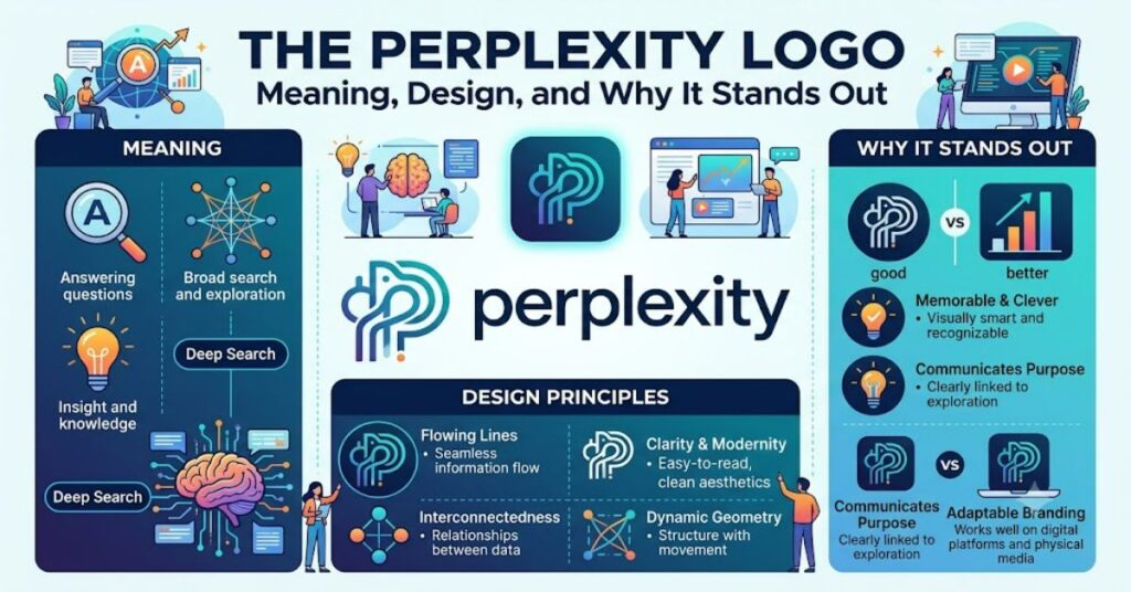
What makes the logo interesting is that it works on several levels at once. It can resemble a connected graph, a compass-like navigation symbol, a search pathway, or a node-based knowledge network. That ambiguity is intentional: Perplexity is positioning itself not merely as a search engine, but as a tool that helps users discover relationships between pieces of information.
What the Perplexity Logo Represents
According to publicly discussed branding materials around the 2023 redesign, the emblem was designed to communicate the architecture of information discovery.
Several interpretations are commonly associated with the mark:
| Visual Element | Possible Meaning |
| Intersecting lines | Connections between ideas |
| Outlined geometry | Transparency and clarity |
| Network-like structure | Knowledge graphs and linked information |
| Symmetrical form | Order emerging from complexity |
| Open negative space | Room for exploration and inquiry |
Why the 2023 Rebrand Mattered
Perplexity AI was growing rapidly as users looked for alternatives to traditional web search. The company needed a visual identity that could:
- Differentiate it from search engines built around keyword results.
- Signal an AI-first product.
- Work across mobile, desktop, and conversational interfaces.
- Remain recognizable at very small sizes.
The previous branding was functional but less distinctive. The new identity introduced a cleaner symbol, stronger typography, and a more consistent color system.
Design Analysis: Why It Works
1. It avoids obvious AI clichés
Many AI brands use brains, circuits, or glowing gradients. Perplexity instead uses abstract geometry, which feels more timeless and less trend-dependent.
2. It scales exceptionally well
One practical advantage of the logo is readability at small sizes. The outlined structure remains recognizable in app icons, browser tabs, and social avatars.
3. It suggests navigation
Some viewers interpret the symbol as a compass or directional marker. That aligns well with a product whose goal is to help users find answers and navigate information.
Perplexity vs. Other AI Brand Identities
| Company | Visual Style | Primary Brand Message |
| Perplexity | Geometric network mark | Connected knowledge discovery |
| OpenAI | Interwoven knot symbol | Human-AI collaboration |
| Anthropic | Minimal wordmark | Research-driven AI |
| Google Gemini | Gradient star motif | Generative AI assistance |
| Microsoft Copilot | Ribbon-like gradient icon | Productivity integration |
Real-World Brand Impact
In technology branding, recognition often depends on consistency rather than complexity. Since the rebrand, Perplexity has used the logo across:
- Its web interface
- Mobile applications
- Social media profiles
- Product announcements
- Investor and press materials
That consistency helps users associate the symbol with a specific type of experience: asking questions and receiving synthesized answers.
An Underappreciated Insight
One insight often missed in discussions about the logo
One insight often missed in discussions about the logo is that its outlined construction mirrors how AI systems reference and connect sources.
Filled shapes typically communicate certainty and solidity. Outlined shapes, by contrast, can suggest relationships, pathways, and structures. For a company built around linking information from multiple sources, that design choice is surprisingly fitting.
The Future of the Perplexity Logo in 2027
By 2027, AI products are likely to compete less on novelty and more on trust, usability, and ecosystem integration.
If Perplexity continues expanding into areas such as research, shopping, enterprise search, and agent-based workflows, the logo may become increasingly valuable as a trust marker across multiple products.
One trend worth watching is whether AI brands move toward simpler, more durable visual identities. If that happens, Perplexity’s geometric mark may age better than many gradient-heavy AI logos that reflect current design fashions.
Takeaways
- The perplexity logo was introduced during the company’s 2023 rebrand.
- It uses intersecting geometric outlines to represent connected knowledge and information discovery.
- The blue-and-white palette reinforces clarity, trust, and simplicity.
- The logo stands out by avoiding common AI visual clichés.
- Its scalability makes it effective across apps, websites, and social platforms.
- The design aligns closely with Perplexity’s positioning as an AI-powered answer engine.
Conclusion
The perplexity logo succeeds because it communicates an idea rather than merely decorating a product. Its geometric structure suggests networks, pathways, and interconnected knowledge—concepts that sit at the center of Perplexity AI’s mission.
In a crowded AI market filled with futuristic gradients and generic tech symbols, the logo feels unusually restrained. That restraint may ultimately become its greatest strength. As AI tools become more common, brands that project clarity, reliability, and intellectual structure are likely to stand out more than those that chase visual trends.
Whether viewed as a knowledge graph, a navigation marker, or an abstract network, the emblem captures a simple idea: finding meaning by connecting information.
FAQ
Who designed the Perplexity logo?
The logo was developed as part of Perplexity AI’s late-2023 rebrand in collaboration with the branding agency Smith & Diction.
What does the Perplexity logo mean?
It is generally interpreted as representing connected knowledge, information networks, and the process of discovering relationships between ideas.
Why is the logo blue?
Blue is commonly associated with trust, clarity, and reliability, making it a popular choice for technology and information brands.
Is the Perplexity logo a letter or symbol?
It is an abstract geometric symbol rather than a stylized letter.
When did Perplexity change its logo?
The major rebrand introducing the current logo occurred in late 2023.
Methodology
This analysis is based on publicly available information about Perplexity AI’s 2023 rebrand, visual inspection of the logo, and comparative branding analysis of major AI companies. Interpretations of the symbol’s meaning are analytical rather than official statements unless explicitly attributed to Perplexity or Smith & Diction.
References
- Smith & Diction. (2023). Branding Perplexity AI.
- Perplexity AI. (2023–2026). Public brand and product materials.
- Industry analysis of AI brand identities and visual design trends.